
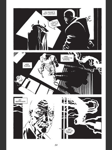
 One of our examples of noir from week 1 was Sin City. The film is built directly from stories from Frank Miller’s series of Sin City graphic novels. Miller had been bringing a noir style to his work for a long time before, but in Sin City he exaggerates it, hyperbolizes it, practically to the point of parody. Everything is heavily shadowed, in stark black and white. That venetian blind effect is prominent throughout the works, and instead of adding subtle meaning like it did in the 40s, it’s now more like a label that says “noir.”
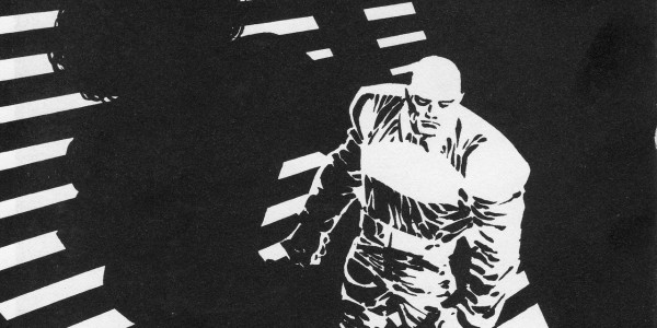
So when it got translated into film, they took that exaggerated style and tried to approximate it as well as they could with photographic effects. It’s like an amplification and feedback loop, taking the self-conscious styling of neo-noir through a grand mutation – mutant noir. That is not meant as a criticism, however. The heavily stylized visuals are perfect for the over-the-topness of the scripts.
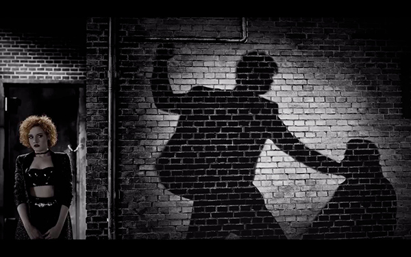 I thought the films did a better job of adding the splashes of color here and there. In the graphic novels they come across as garish. Notice how the scene takes the unnatural shadows of noir a step further with the glowing mortar between the bricks.
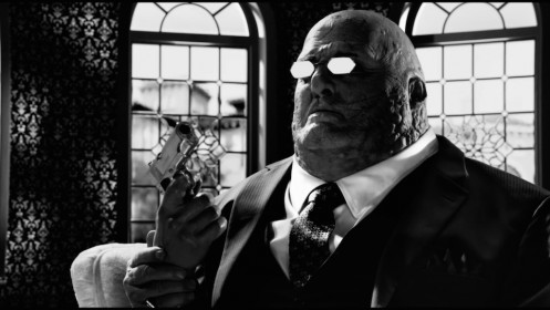
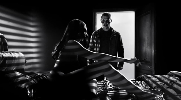
Speaking of mutants, I hope that’s not what Stacy Keach actually looks like these days. The stark white of the eyeglasses is another example of the unnatural exaggeration brought from the comic into the film.