
For my second design assignment, i chose Groom’s “Create A READ Poster.” If you’ve spent as much time in the library as i have, this assignment is great. It also brings back great memories, actually. Since 8/15 stars this week have to be from The Wire, i chose episode 9 of season 2, which i recently watched. My favorite, well, most memorable part of this episode was Ziggy’s duck dying. Let’s be real, nothing good ever lasts for Ziggy so the duck had to go eventually. Like one of the workers said at the bar, who gives a duck whiskey or any alcohol to be exact. Oh, Ziggy. That’s what makes his character lovable and interesting, right? We pity him so he can get away with a lot more than the average. Anyways, Let’s get down to business.
Process:
This assignment took a little longer than i expected. I spent most of the time messing around with features and cool effects, etc. Since you know i chose the death of the duck, my big question was: “How can i make this funny?”. I love animals and don’t believe in the maltreatment of them but this is a show. It’s not like Ziggy killed it on purpose.
Background
Thinking back on my childhood and READ posters, the one thing they all had in common were the weird/cheesy backgrounds. The celebrity could have been really cool and attractive yet the backgrounds were always weird. It was the late 90s though, so to be fair, everything was weird. I went on google and looked up “weird 90s backgrounds” and had a couple laughs before i settled with a background. It’s your typical teal, purple, blue, and yellow shapes. After the i had my background, i needed to get a picture of the dead duck.
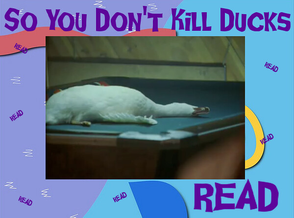
Main Photo
Similar to my past assignments, i went to the wire106 webpage and opened up episode 9 from season 2. Then i had to search for the scene because i couldn’t remember where it was. After maybe 30 seconds i found it and used the famous “Command+Shift+4″ keys to get a screenshot. My first screenshot was a little blurry so i had to redo it. Next!
Dead Duck
GIMP, we meet again. I opened up the 90s background and was pleased with the size. I didn’t have to scale it any larger or anything else. Then i clicked “open as layers” and put up the dead duck screenshot. I did have to rescale this image a little smaller so i could large enough texts. Now i have my main poster, my next step was text.
Text
Since using dafont.com, i’ve learned to love it. So many different fonts all at my fingertips. It also makes these assignments more fun because they’re not your average font. I wasn’t sure what kind of font i wanted so i went under the “horror” section and roamed. I found “Ghoulish Fright” and it reminded me of the Goosebumps, which were vital to any kids lives during the time, so i had to pick that. After downloading that i opened up GIMP again and did work. I chose purple because it was just a nice accent color to the whole thing. I wasn’t too amused with the final product so i added in small “READ” texts and rotated them around to look cool. NOW i was pleased. So admire my work and tell me what you think!
Stars:3