Designblitz. Yay! Very similar to the Photoblitz assignment i did, now i get to focus on new elements of design. They’re mostly new to me, not the world. This weekend i went home for a concert and decided that with a car/home, i’ll find better, more interesting examples of these elements. This has proven to be true because the first photo i took was awesome. Let me tell you..
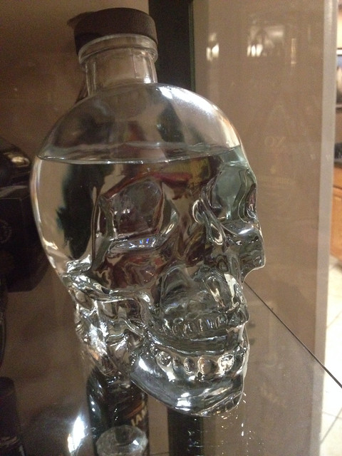
Symbols/Metaphors
This element is probably the most basic and important element on the list. At least to me. I was tempted to take a picture of various signs but that seemed too common. While i was roaming around my house for some food, i took a look at my father’s liquor cabinet. Now, i am only 19 but it’s not against the law to look, right? The one bottle that caught my eye was this clear liquid in a skull shaped bottle. I say clear because i have no idea what kind of alcohol it is. The most important thing about this was the skull. What could is symbolize? The deadliness of the liquid? The awesomeness? The deadly effect? Or killer effect? I suppose if you’re familiar with this liquid, you already know the answer. But this is what i chose for the “Symbols/Metaphors” element of design. If i had to guess, i would say the bottle signifies the “killer effect” because that just sounds awesome and you know it!
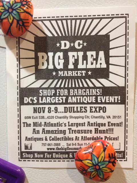
Typography
Words. They only make up our whole life, yes? It only makes sense how important the type of font is. I’m not going to blabber about this but let’s be serious. Font changes people. Wether it attracts your attention or makes you feel some type of way. As i was looking for food, again, i was stuck on my fridge doors looking at all the different things. I saw this ad about a local flea market. The reason i chose this was because exactly that. The little flyer caught my attention because of the bold, unique font. It reminded me of the circus. Aren’t flea markets like circuses though? They have so many different things yet there’s not limit. On top of that, you’re entertained. The font definitely succeeded in grabbing my family’s attention because my mom/dad don’t even like flea markets. You decide!
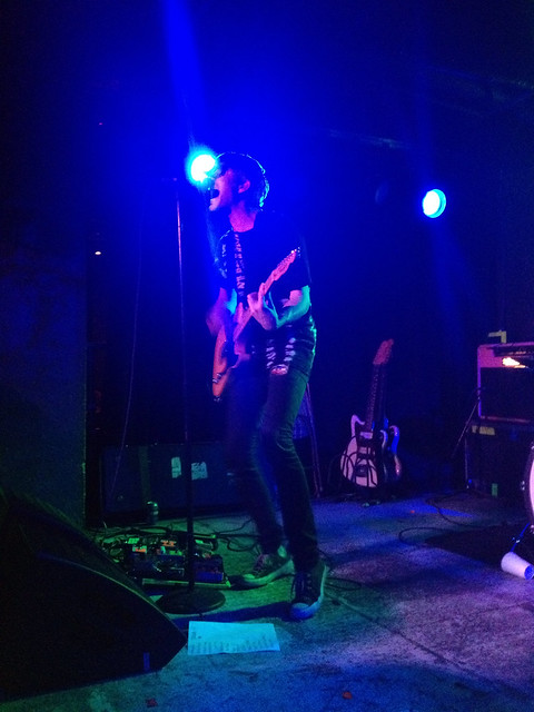
Color
Like the document says, color creates mood. I’m glad this assignment is being done this week because it’s during the week i had a concert to go to. One of the biggest parts of a concert, besides the music, is the lighting. The band and venue hire people specifically for the job. I mean, if you’re listening to a very sad song and the lighting is all bright and jumpy, that ruins the mood for the show, right? I took some pictures of the show and chose my favorite one that exemplified the color element of the design. I saw We Are Scientists in DC and captured a great photo of lead singer Keith Murray doing his thing. The lights in the picture are a medium almost dark blue and it went together with the song. He sang “Sprinkles” which is pretty slow compared to their other music and overall a gloomy song. So when the lights went from bright oranges, pinks, and green to blue, the whole mood and atmosphere of the venue change. This was perfect for “Color.” So if have a chance, listen to the song and tell me if you agree or not.
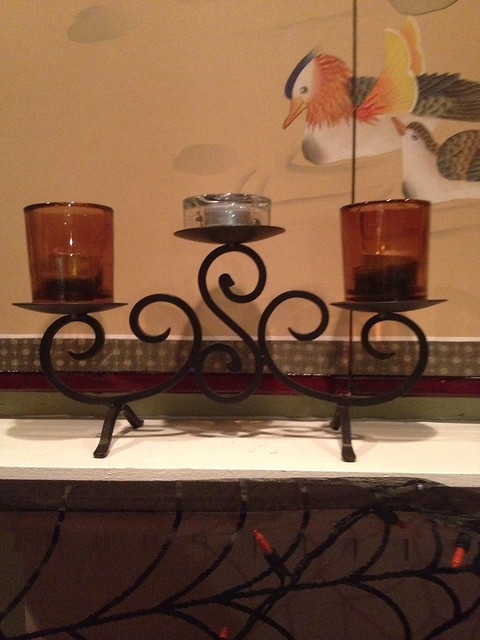
Balance
For my last picture, i chose balance. I feel like this concept was a lot more difficult than i thought. To me, balance is different with every person. To Some people, two sides have to be the same or look the same or something that is the same. Something that i found to be of “balance” was this candle holder on my parent’s mantel. Both sides are equal and the center is equal as well. If you cut through the center of the photo, it’s symmetrical. Balance occurs more often in architecture and design. Like i said, this was a little more difficult than i thought. It makes a lot more sense in my head than in this post but it works, i swear! But there you have it! 4 examples of the various elements of design!