
Finally! My last visual assignment for this week! This week i’ve been getting too comfortable with GIMP by simply cropping and adding text. I felt like with my last visual assignment of the week i should do something i haven’t done before. I mean, this class is about becoming familiar with different skills, right? RIGHT. I decided to go with “Splash The Color” worth 3 stars. Let’s get to it!
The Picture:
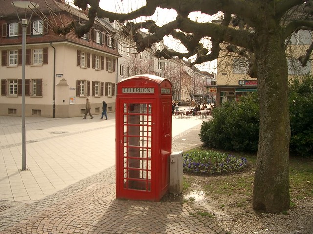
Finding a picture that has a main focal point is pretty easy. The hard part is finding the right picture, at least for me it was! I was looking around my room for some inspiration and made a dead lock on my poster. It’s of a double deck bus roaming the streets of London. What else is red and stands out in the London? Phone booths! As i searched on google for a simple British phone booth, there were some where the background was already grey and the booth was a bright red. This discouraged me a little bit but i still wanted to do it. Don’t worry, i didn’t just download that picture to my computer and put it on Flickr! I promise. Now that i chose my picture, i needed to figure out how to do this whole splash of color thing, so i searched on YouTube.
The Process:
This wasn’t as bad as i thought it would. I’m not a big fan of Photoshop because i don’t feel like getting a 30 day trial and then having to stop using it. Since GIMP is free, i’m sticking to that. Maybe if i become a big photo editor one day i’ll buy Photoshop. Back to the process, here it is! I found this GREAT tutorial on YouTube right here. Since most of the online tutorials involved Photoshop, i quickly stuck to this one. Now this nice guy offers two choices on the whole process. I attempted to do the first one, but it wasn’t as easy because his operating system is windows and not a mac, like me. So skip to 2:46 and you’ll be better off, trust me.
Duplicate The Layer
Ah, yes, Like the title says, the first step is duplicating the layer. It’s really simple, trust me. Just go under the “Layers” tab and select “Duplicate Layer”. What this does now is adds the exact same picture on top of your current picture. You know, like duplicates it or something. Now you’re good. Under the same “Layer” category, you want to scroll down to “Transparency” and select “Add Alpha Channel”. Sound familiar, right? It’s the same thing you need to do when you’re cropping out faces. What this “Alpha Channel” does is it allows you to erase the top picture and when you do so, it reveals the second picture and not just a plain background. YAY! Next step!
Colors
Mhmm. Colors. That’s what this whole thing is about, right? Your next step is to go under the “colors” or “colours” if you’re british, and selected “desaturate”. Although you bio geeks might think this involves Carbon and Hydrogen bonds, not exactly. Next it’s going to ask you what kind of desaturation. I chose “Luminosity” like the video said because it makes the picture pop. Now you can begin erasing.
Erasing
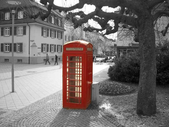
Finally, let’s get those colors to pop. Take the eraser button (making sure it’s not too big) and erase the object you wish to have color. For me, this was the red phone booth. This step is the trickiest because you want to be careful to stay in the lines. Once you go out, now you’ve added random color splashes to the background. This happened to me. Need not worry! There is a kind of simple way to fix this. Once you’re done erasing the object, click on the paintbrush tool. What you need to make sure is that you’ve changed the color of that paintbrush to a similar tint of what you want to lack color. Like i said, this happened to me. I attempted to fix it but it’s still a little obvious. But that’s okay! We’re not professionals. WOW! Now we’re done! The moment you’ve all been looking for. My “Splash The Color”.
Before
After:
Now, tell me if you can spot my mess up. Actually, no. Don’t ruin this for me. I’m too proud!
Stars: 3