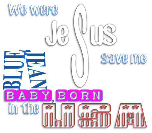
For my final design assignment I did “Lyric Typography Poster” (3.5 stars). I did “American Kids” by Kenny Chesney. In case you haven’t been able to tell by this point, I really like that song. It also has some vivid words that I figured I could find good fonts and could think of cool things to do with the words for.
How I did it:
I actually used Microsoft Word for this, which is my go to in case you haven’t yet figured that out. I used word art. I actually downloaded three new fonts for this project from dafont.com. They were CF Jack Story, USA Flag, and Baby Blocks. I had to mess around with the different text effects until I found ones that looked like what I wanted. For the “Jesus” (supposed to look like a cross) I had to make the middle “S” separate from the rest of the word so that I could make it bigger and stretch it out until it looked like a cross. The blue and jean are supposed to look like a pair of pants and I had to mess with their effects and change the tapering so that it looked similar to pants. The rest of them are just the fonts. But I wanted to put them together in a way so that it flowed and it was fairly condensed and I am pretty happy with how it turned out! ![]()