
Here are my images for the DesignBlitz this week and the elements that they represent (or mess up) in my eyes.
Typography:
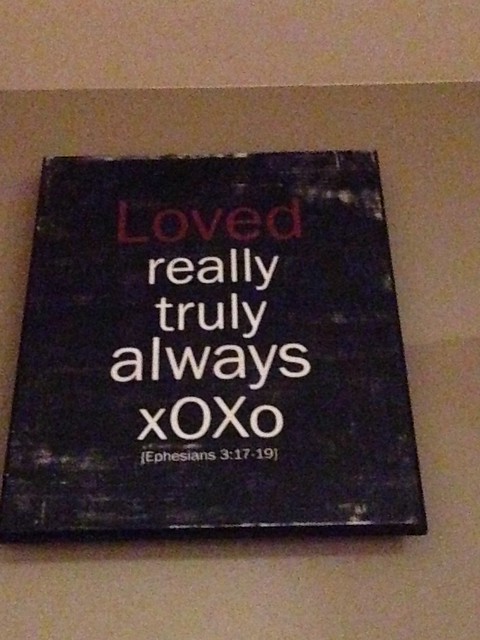
Typography is supposed to be bringing words to life. The reason I like this sign is because you can see how the word “love” is emphasized. In this case it is emphasized using color. I also like how it is simple and the font is simple, so is the style it was typed in–middle justified. The repetition–due to the simple nature of the words–also emphasizes the simplicity of it. I also like how Ephesians 3:17-19 is in brackets and is significantly smaller than the rest of the fonts. It emphasizes the fact that it is an “afterthought” kind of. It shows that it isn’t part of the main text.
Unity:
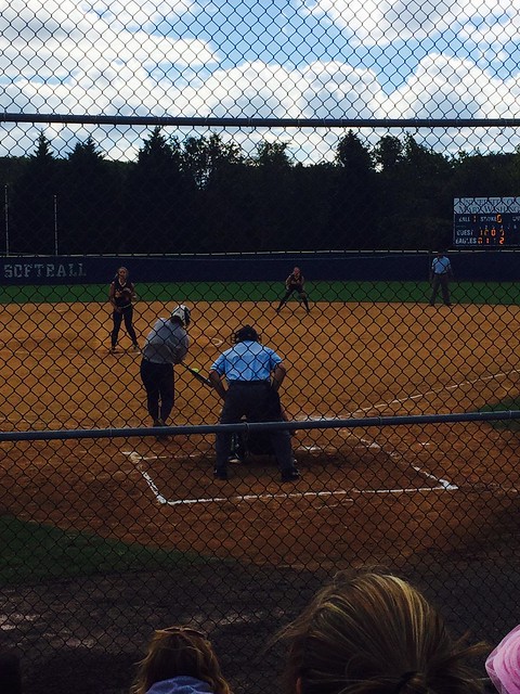
Unity is the relationship between independent parts of the picture and the picture as a whole. To me–and probably not to others–this picture represents unity. The unity is not only visual, but is also in the context of the picture. This is a picture of me (taken by a former teammate) at my scrimmage on Saturday. The visual unity is obvious, the bat meeting the ball. It is also in the fact that everything is facing the ball–not only my head, shoulders, hips, hands, etc…but everyone else’s eyes as well. The unity in the context: this scrimmage was the culmination of everything I (and my team) have worked on this fall. Everything coming together as one with a good end result (a double)!
Balance:
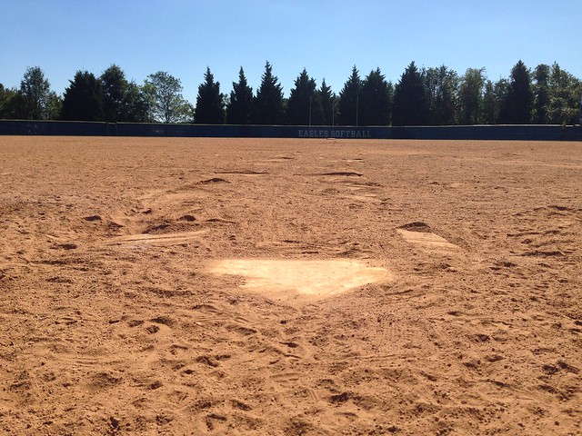
Balance is equilibrium. I figured that my field would be balanced, especially looking out from behind home plate. Well, it turns out that the Eagles Softball in center field isn’t exactly in the middle. So that kind of messed up my balance idea. I still think it is a pretty balanced picture besides that. This is pretty much the most balanced picture I could think of.
Color:
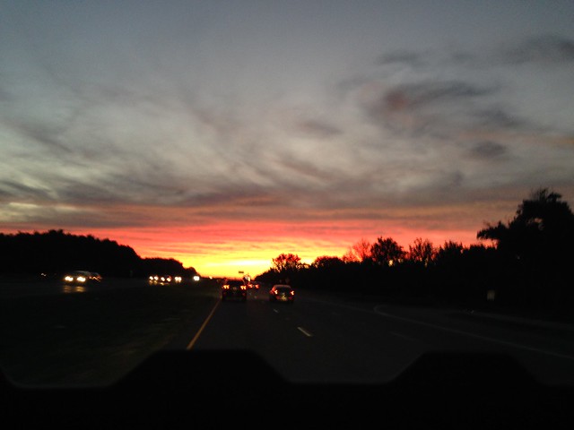
Color creates mood and draws attention. I would say that this sunset picture definitely draws attention to the focal point of the picture–the actual sunset. I don’t like that it was a little blurry but I was in a car so it was hard to get a clear picture that actually showed the colors. Obviously this picture does it no justice, but it is still pretty. I also like that it isn’t the whole sky that is lit up in color. I like the contrast between the yellow and pink and the grey of the sky and clouds above it.