
My third Design Assignment is full of creativity and awesomeness. I chose to do the “Bumper Sticker” assignment. I’m not sure if its the design assignment bank or me but i keep choosing all these create and add text assignments. I’m having fun with them so, who cares. Let’s get to it.
Process:
Instead of doing one i went for two so i could feel like i deserved the whole 3.5 stars. I searched on google and there were loads of editing sites that do all the work for you. Call me old school but i just used GIMP again. I’m still sticking to episode 9 of season two so i chose the scene where the police discover the crack and then when Daniel’s says “we’re patient mother f*ckers”. I felt that they stood out enough so why not. Now i’m going to go through each bumper sticker rather than doing a step by step.
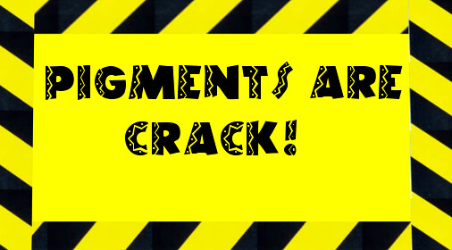
Pigments Are Crack:
Like i said, this bumper sticker came from the bust of the drugs that the Greeks tipped off. It was a clever and funny scene. Seeing how this was all about the police, i went for a caution tape theme. I went on google and searched for a plain yellow background. After that, i searched for the black and yellow stripes of caution tape. It was hard to find a good picture but i found a decent one. After i opened GIMP, i opened the yellow background then the caution tape in layers. Since i wanted to border the whole thing i rescaled the caution tape to fit the border and then i moved the layer appropriately. I repeated this step 3 more times since, you know, squares are 4 sided. I would say this was the hardest part because it was difficult to get each side the angle and so on. You can tell this was done by my hands. It’s still art, though! Once again, i went to dafont.com and searched for a hispanic theme. Sadly, all they had were mexican themed fonts so i chose one of those. It spiced it up so i’m happy. The font title was called “El Riot”. Since bumper stickers are pretty basic i just thought to write “Pigments are crack” because in this episode they literally were and i suppose to an artist they are as well. Here it is!
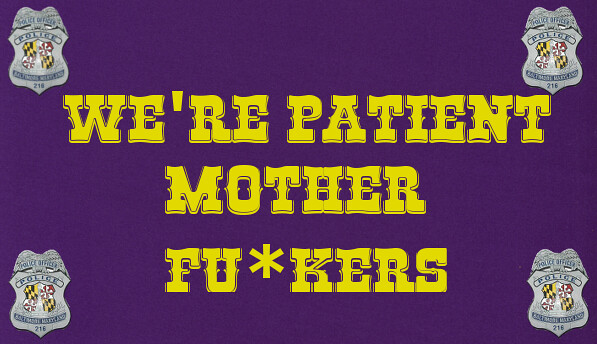
Patient
This bumper sticker took a little more work than my first one. Since i chose the scene where Daniel’s refers to himself as a patient mother fu*cker, i played with the police theme again. I know very little of Baltimore except for the Ravens and the O’s. I didn’t want to use orange as a background so i chose purple for the ravens. I googled Baltimore PD badges and found this awesome basic badge. I opened GIMP and cut out the badge so i could use it as a border (the same steps used in my PNG blog post here.) I then opened the purple background and opened up the badge as a layer. I had to rescale the badge and then export the size so i wouldn’t have to rescale it every time i opened it as a layer. I took the badge and put one in every corner. I was tempted to use it all around but it looked too crowded. We all know i’m obsessed with font so AGAIN i went to dafont.com and chose the “Rio Grande” font because it was all western and reminded me of a wanted sign from the wild west. Great! I’m almost done. I had to adjust the font size and chose yellow as the color because it popped out better than black and it is on the flag in the badges! LOOK. I’M DONE. HERE IT IS. IT’S AWESOME.
Stars: 3.5