I had to pick up some groceries, so I decided to take care of my Designblitz while wandering the aisles. I actually had a man tell me to “buy everything” when he saw me starting endlessly at the coffee and tea choices. Little did he know that I was doing a school assignment and not trying to figure out what brand or flavor to try.
Typography
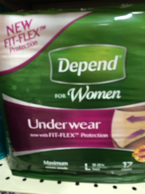
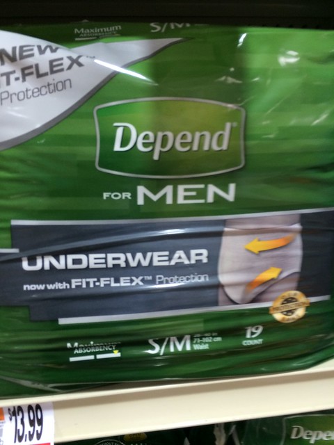
For a while now I’ve been aware how gendered design is, even down to the typography. Consider how adult diapers for males and for women differ in their designs. The women have a more fluid, almost cursive-like font while the men have a very straight and stocky font.
Metaphors/ Symbols
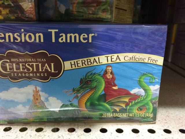
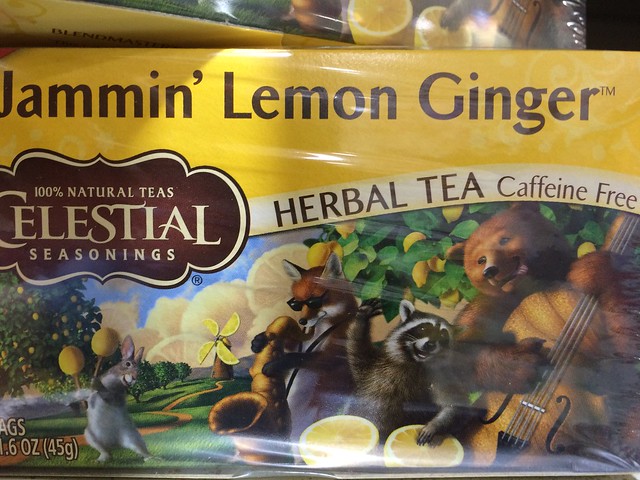
Celestial Teas are really big on illustrating the tea in creative ways. Tension Tamer features a princess and a dragon. Jammin Lemon Ginger features animals jammin on instruments made with lemons.
Minimalism/ Use of Space
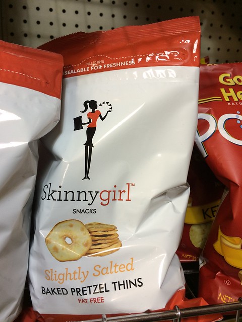
The Skinnygirl brand of snack foods uses minimalism to suggest low calories and weight loss, as if a simpler design could indicate the possibility of a slimmer waist.
Form/ Function/ Message
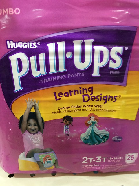
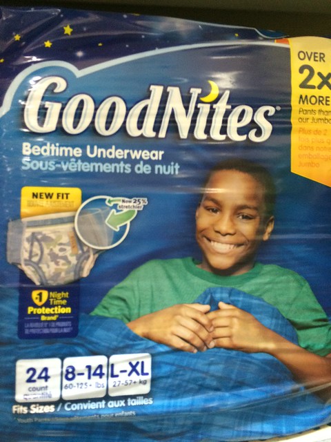
Children’s diapers are an interesting example of sharing multiple messages through designs. Like most things for infants/ toddlers/ kids, they are color-coded for gender. The girls’ pull-ups have a pink, purple, and yellow design and feature a Disney princess on them. The boys’ bedtime underwear has blue, green, and yellow in the design.
In the pull-ups ad, the girl’s shirt reads “Big Kid” and she’s got her arms lifted. Likewise, the curve of the banner moves slightly upward. The font for “learning designs” has a preschool/ juvenile handwriting feel to it. The font for “pull ups” is thick and straight, almost suggesting the “pull up” action.
For the boys’ bedtime underwear, we have a smiling kid free of the dread of wetting the bed in his sleep. We also have a moon as part of the “GoodNites” logo. The font, while not something basic like Helvetic, seems more grown-up than the font on the Pull-Ups, so as to suggest this isn’t for babies.