
While perusing the resources provided for elements of design this week, I was suddenly struck by an idea of another type of artwork. Surprisingly, a search of what I was looking for didn’t turn up, so I decided to submit my own. Since we need to come up with two assignments over the semester, this was perfect.
The idea is to design an app icon, like one you’d see as a shortcut on a tablet or smartphone. One thing I’ve noticed is how much the designers try to get across in such a limited amount of space. You don’t want too many things, because your icon will come out looking cramped and unappealing. Conversely, you want enough detail so consumers know what they’re using upon a glance. In terms of marketing, first impressions are everything. So using GIMP, I came up with my own icon design:
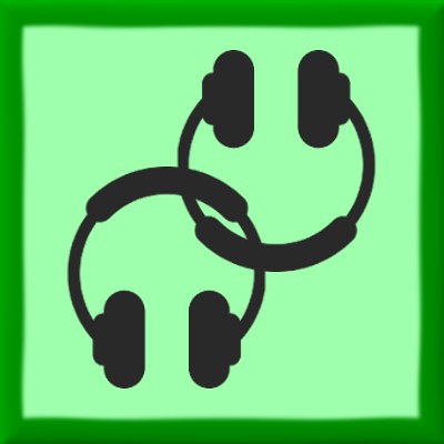
Introducing Unisono! As someone currently in a long distance relationship, one struggle we have to go through is finding ways to do activities together while separated by time and distance. Thankfully due to the wonders of technology and the internet, there are ways to sync up movies, tv shows, and so on. But there aren’t too many options while on the go. So the idea behind this app is that two people are synchronized to a music station sort of like Pandora, but they get to listen to the same songs at the same time. This way they can still share something simple and enjoyable together even when they’re far apart. They can individually rate songs to determine what sort of style the station can be, and the app will provide a text chat interface for easy communication. Unfortunately I have almost zero programming skills, so I can’t actually make such an app. But at least I can try to design an icon!
I started with a square 400×400 canvas. I colored it a monotone green, and use the bevel effect for the edges. I then colored in the inner part of the square a lighter shade of green to establish a border. Using the attributed headphones clip art, I made two copies in two separate layers, and resized them accordingly. I then tried to link them up as symmetrically as possible. I then applied a wave effect over the edges to give them a very subtle sort of fluid look. I then merged the layers together and exported the whole thing. I tried to go for a design with a both a minimalistic approach, while using the form to describe the function. The linked headphones are almost like links in a chain, to represent the synchronization of the music. All in all I had a lot of fun designing this, as I had to approach it a lot differently than I did my other projects.
Difficult: 3 stars
Attributions: Headphones designed by Darren Dutch from the Noun Project