
Week 6 is all about that design life. I get it, designing all week.. I mean we have to 15 stars, like whoa.. Any who, i was a little late to this scene so i started off with a somewhat simple assignment. For my first Design Assignment, i chose “Create Your Favorite Book Cover.” Everyone enjoys reading, right? Right. I have a lot of favorite books, some i’d rather not mention (Twilight L O L) so it was somewhat difficult to choose a book. Last semester I took a film adaptation class and those were the most recent books I read. I was stuck between Do Android Dream of Electric Sheep and Less Than Zero. I ultimately chose Less Than Zero because one of my all time favorite movie is American Psycho which is based off of a novel by Easton Brett Ellis who also wrote Less Than Zero. This doesn’t mean i don’t like Less Than Zero! I just.. well, I’m confused now. POINT BEING, i chose that novel because it was pretty darn interesting and the movie was decent.
Process:
Font
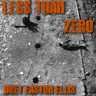
Recreating a book cover shouldn’t be as difficult as it seems, right? Instead of just taking the easy route, i decided to play around with GIMP text and fonts so i could be familiar with it. I did an assignment last week similar to this here, and my font was lacking. So I googled font sites that provided me with free, AWESOME, fonts. I ended up on dafont.com There were thousands to choose from which made it another hard process. Instead of picking the prettiest font, i took the story of the book into consideration. For those of you who haven’t seen the film or read Less Than Zero, it’s about a group of rich kids in Cali and one of them (Julian) gets involved with drugs and has a huge strain on the lives of his friends. I went under the “Destroy” category and found this pretty sick font called “Rock’s Death”. It’s similar to the DS106 logo but not as scratchy, at least to me. Now that i have this cool font, i need a cover photo. That’s only the most important part. People will be judging the book off of my new cover, obviously, so i need to make it great.
Photo
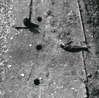
I was in search of a photo that gave off the feeling of loneliness, despair, and everything else that’s depressing in life. Since the book is about drugs and horrible people, why not? I was a little broad and first searched “Emotional Drug Scene” on google. After scrolling through pictures of pills and needles, i found this really cool picture of this guy on the ground desperately. PERFECT. It was also great that the picture was in B&W because it makes it look even more sad. Since i’ve talked up this picture, i might as well show you what it was before i added the text! Here it is: (if you don’t think it’s sad looking, you’re crazy)
Text:
The next step was adding the actual text to the photo. As i mentioned earlier, i didn’t want to just slap the font on the picture and call it a day. I’m eventually going to need to learn effects and stuff, right? Might as well use this assignment for learning. After i downloaded the font from dafont.com, i was having trouble finding this font in GIMP. I asked Groom for his help and i used it. The font still wasn’t popping up so I did the next thing that came to mind: Restart. Like in my favorite show The IT Crowd, i used the famous tip “Have you tried turning it on and off again?” I did and then it popped up! Jessica gave me this advice also. So now that i have the font up, size and color are up to bat. I could have gone for red, you know, for blood but i was selfish and chose my favorite color. Orange is great. Plus, it’s October so why not? Since the photo is kind of large i changed the font to 71.
Effects
Ah, almost done! As i said, i wanted to experiment. Groom commented on one of my photos on Flickr giving me a tip on adding text by creating a drop shadow. My font was looking a little lost in the picture so i did so! But, how do i create a drop shadow? More importantly, what is a drop shadow? It makes the text back a shadow background so it pops out and almost looks 3D, at least to my eyes. I found this wiki tutorial and it showed me how to create one. It’s fairly simply so don’t worry. Now that i added the drop shadow, why not fool around with the other filters. I chose “Supernova” and all that did was add a blue background to the font which ruined everything. I’m not being dramatic. It looked horrible, so i took it down. I added “Sparkles” in the author’s name but it didn’t have much of an effect but i still kept it. Finally, i’m done. SIKE. I guess i moved around the picture and ended up cutting some of it off so when i uploaded it to Flickr, there was a white border on the bottom. I had to crop the image and re-export it and upload it again to Flickr. NOW i’m done! I’m happy with it and if i saw this cover in the store, my attention would be drawn to it immediately.
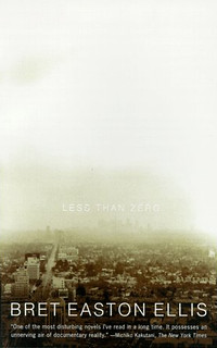
Here is the copy of Less Than Zero i had for english:
Here is my cover edit:
Stars: 3