Design Blitz
After reading the doc about the different elements of design, I grabbed my phone camera and looked around my friend’s room to find objects to describe some of these elements. Some were easier to find than others, but I included some of the best below.
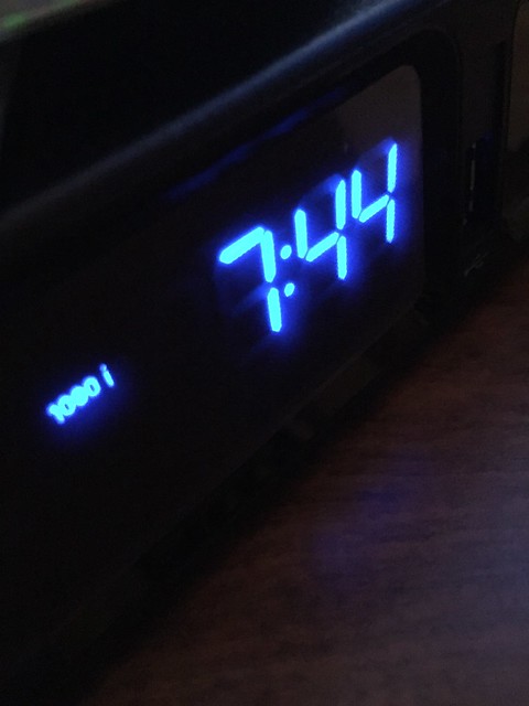
I realized that alarm clocks and cable boxes’ time always has the typical digital font design. When we see this font outside of technology, we tend to always associate it with alarm clocks.
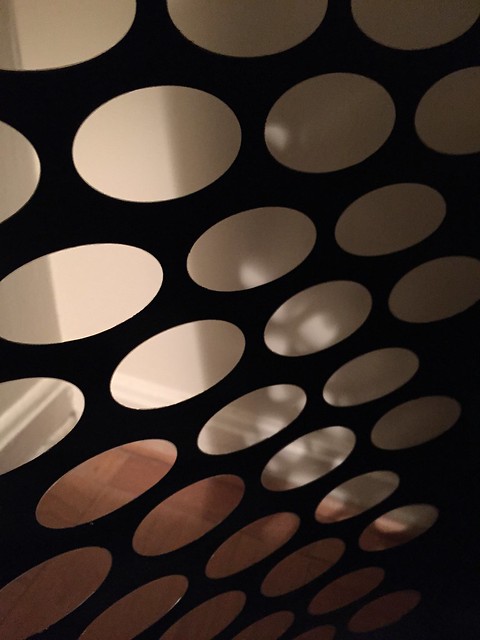
I thought the repetition of the oval-shaped cut-outs on this laundry basket and the shadow being given off by it in the background looked very visually appealing. It also appears minimalistic.
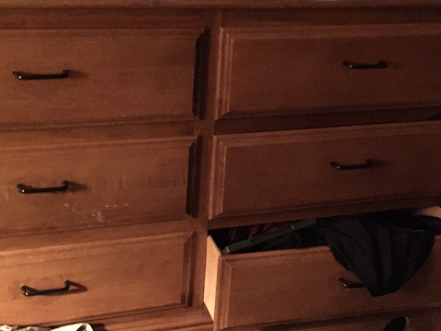
I think this photo represents both dominance and unity. Although each drawer is similar, the one messy, open drawer stands out to me the most (and bugs me!).
I think a lot of us are familiar with red solo cups. In the kitchen, I found a perfect demonstration of proportion. Meet Red Solo Cup Jr.!