Every picture tells a story

Composition

1 symmetry 12 symmetry

The first thing I notice in the second episode is symmetry. Gant’s body is in the center. The camera moves, but mostly maintains an imperfect bilateral symmetry. The imperfections and imbalances are important, because otherwise the composition would appear obvious and artificial, and lose its impact. The episode closes with a symmetrical composition as well, with Daniels’ face in the center of the screen. That mirroring of the opening and closing compositions is a kind of symmetry too.
Coincidentally, I was reading about symmetrical composition in the film journal p.o.v.. The article points out the obvious, that symmetry gives a certain power and importance to scenes and characters, but also says that symmetry is associated with scenes of death, which I did not know. Perhaps that’s why it was used in the morgue.

Color

4 surveillance


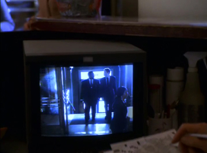
We’ve seen a few shots, like this one, that come from surveillance cameras. You can tell because they’re in black and white. I find this slightly jarring, and not up to the level of subtlety at work in the series. Maybe it’s supposed to highlight the outdated technology.
6 hat


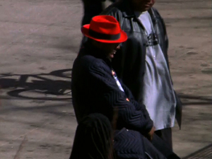
We also see color at work in Bubbles’ hat trick. The red hat jumps out of the shots, acting like a spotlight on whoever he puts it on.


8 D'AngeloUsually the use of color is more subtle. In the interrogation scene with D’Angelo, everything has a muted, neutral tone, mostly grays plus some skin tones. A few accents of yellow show up – the chair, and I think there’s a post-it in there somewhere – which telegraph the yellow legal pad. And that pad is what the scene is all about: getting him to write something.

Every picture tells a story

5 office


The scene in Perlman’s office shows cramped space, piles of boxes and files and papers. It’s a portrait of overwork.


 10 McNulty's home 11 Daniels' home

There’s a short scene in McNulty’s apartment. The place is practically empty. There’s a narrative reason for that – he’s separated from his wife – but it also says something about his character. There’s nothing in his life but the job. Shortly afterward there’s a scene of dinner at the Daniels’ house, which is a stark contrast to McNulty’s place.

9 attention to detail

I like this shot of Freamon at work on his doll house toys. It shows a close attention to fine details. That says a lot about his character, which becomes more apparent as the series goes on.


surveillance-2

Here’s another picture of surveillance. As we said before, it’s a constant theme in The Wire, but what this shot shows is that the camera is on but no one’s paying attention – the person is doing a crossword puzzle.


in-the-holeA series of shots tells a story too. This is just a little scene with no particular significance, but it shows us the nice marble hallway in the police building, then the dark stairwell going down into the basement, then the dark, dungeon-like cellar hall leading to the room where the squad works. It tells us volumes about their status in the department.

Some opening salvos

Here are a few thoughts on some shots from the opening episode of The Wire.

Design

5I love this shot. the two characters are framed in the restaurant window, with “burger” in neon above Wee Bey and “chicken” above D’Angelo. That tells so much about their characters. It’s all in the way the shot is set up. Because those messages are in the background, it’s easy to look at it and without focusing on them. The message comes across even if we’re not consciously aware of it.

8


Inside the FBI office. The design element of line is prominent here, dominating the top half of the shot. In contrast to most of the rest of the show, this setting is modern and clean – it shows where the money is, and by contrast, where it isn’t – see the basement office where the squad works.


Framing

1 2 9 11
The theme of surveillance is constant in the series. We see these frame within a frame shots, showing us scenes of monitors, through windows, in mirrors, all of which have us watching action rather than being in the midst of it.

3
 

Bunk and McNulty in a vacant with a decomposing corpse. The way they’re framed in the doorway, all they have in front of them is darkness. It’s like they’re gazing into the abyss.


Color

7
 
That dingy yellow coloring infects many scenes in the first few episodes. It gives things a run-down appearance, which is especially effective here.


Composition

4 10
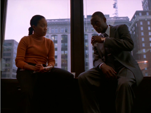
In each of these shots, and the first one above, we see a strong vertical line separating two characters. This serves to frame the characters separately. It could signal a number of things, from difference and disagreement to two sides of the same story. It makes for some strong images though.

String doing his thing

string2

This scene from The Wire caught my eye from a design and photography standpoint. There’s an interesting color contrast going on between the reddish tones of Stringer’s shirt and tie and the greenish background. Red and green are what is known as complementary colors. These are colors that fall on opposites sides of a color wheel. Visually, they tend to stand out against each other. In this image, the colors are muted, which adds a nice subtlety to the contrast. None of that happened by accident, of course. Every shot and scene is designed, meaning the photographer, the lighting director, the set and costume designers, all made deliberate decisions in their respective roles to further the story. I should note that this comes from a Youtube video, so the colors may have been distorted in all the processing between ripping, uploading and converting.

When the scene got to the part where String was counting the money, I had to make a GIF of it. String is all about the money – he’s playing the Game to win. So a looping GIF would tell a succinct little story about him.

I used a Firefox add-on to download the video, then used MPEG Streamclip to extract this segment and export it as a MOV file. The key there was to take just enough and no more. I started at a point where his hands were apart and inched the scene forward to the next point where his hands were apart. That way the looping should be invisible. I imported that into Photoshop, converting the video to frames, and used the Save for Web function to make it a GIF. I put the result on Tumblr.

When I looked back on it, I thought the head and knee movements were distracting so I wanted to freeze them. I opened the GIF up again in Photoshop, went to the top layer and created a new empty layer on top of it. Then I went back to the previous top layer, selected the whole thing, copy and pasted it on to the new top layer, and used the polygonal selection tool to cut out the area where his hands and money was. I used 4 pixels of feathering to soften the edges of the cut-out so it would blend better. Here’s a picture of my photoshop screen when I was done:

photoshop

And that’s how I got this picture of String doing his thing.

#wire106 Comin’ Yo!

The video George Velestianos linked to in the above tweet gets at what #wire106 could be far better than my  last post introducing this fall’s #ds106. It’s all about “Omar comin’”!  Make Art, dammit, because it’s all in the game, yo! 

Also, for anyone interested—and this ofer may be limited to folks in the—you can sign-up for a free, 30-day trial of Amazon Prime so that you can binge watch the first few seasons to get yourself in #ds106 creating shape :) See you in Hamsterdam, hippies!