Wire 106: S02E010 “Storm Warnings”

For this video discussion of Season 2 Episode 10 of The Wire, “Storm Warnings,” Paul Bond and I were joined by quite a number of UMW #wire106 internauts Demi Fulcher, Alison Thoet, Stefanie Reutter, Meredith Fierro, and Maggie Stough. This discussion was once again focused around screenshots from this episode that each participant shared in order to speak to design in some fashion. These screenshots could be about composition, set design, costume design, etc. My initial series of shots to get the conversation rolling were focused around various surfaces, in particular countertops, as design spaces in this episode. Interesting how rich these seemingly invisible spaces are when you slow down to look carefully. Having a shared focus of attention for the discussions like these screenshots is proving really useful, and relatively successful.

The thirty screenshots we discussed are included below just in case you want a closer look. Enjoy!

Screen Shot 2014-10-02 at 2.44.32 PM
Screen Shot 2014-10-02 at 2.56.05 PM
Screen Shot 2014-10-02 at 2.53.19 PM
gun on the counter
Screen Shot 2014-10-02 at 2.47.25 PM
Screen Shot 2014-10-02 at 2.45.08 PM
Screen Shot 2014-10-02 at 2.47.10 PM
Screen Shot 2014-10-02 at 2.48.48 PM
Screen Shot 2014-10-02 at 2.51.38 PM
election posters
FBI
Ziggy
Window
Screen Shot 2014-10-02 at 2.54.54 PM
Screen Shot 2014-10-02 at 2.55.12 PM
Scene 2
Scene 1
ziggy losing it
Scene 3
Scene 4
Minimalist
Screen_Shot_2014-10-02_at_1_31_05_PM
looks like a container
Stand off 2
Stand off 1
Screen_Shot_2014-10-02_at_1_22_07_PM
Screen_Shot_2014-10-02_at_1_40_03_PM
art museum
Screen Shot 2014-10-02 at 2.58.26 PM
Screen Shot 2014-10-02 at 2.59.14 PM

Wire 106: S02E09 “Stray Rounds”


For this video discussion of Season 2 Episode 9 of The Wire, “Stray Rounds,” Paul Bond and I were joined by UMW #wire106 internauts Lakisha Mahone and Nicky Memita. This discussion was pretty tight, and I found it a lot of fun. Since we’ve been coordinating discussions more by having everyone who is joining share a few screenshots from the episode they want to discuss in relationship to design. These screenshots could be composition, set design, costume design, etc. The idea is to have a shared focus of attention for the discussions, and I think it is working pretty well.

We spent a fair share of time talking about twenty screenshots. I’m including them below just in case you want a closer look. Enjoy!

Screen Shot 2014-10-01 at 1.37.19 PM
Screen Shot 2014-10-01 at 1.37.42 PM
Screen Shot 2014-10-01 at 1.38.28 PM
Screen Shot 2014-10-01 at 1.39.08 PM
Screen Shot 2014-10-01 at 1.39.39 PM
Screen Shot 2014-10-01 at 1.40.05 PM
Screen Shot 2014-10-01 at 1.40.24 PM
Screen Shot 2014-10-01 at 1.41.14 PM
Screen Shot 2014-10-01 at 1.42.18 PM
Screen Shot 2014-10-01 at 1.43.34 PM
Screen Shot 2014-10-01 at 1.44.18 PM
Screen Shot 2014-10-01 at 1.44.57 PM
Screen Shot 2014-10-01 at 1.45.42 PM
Screen Shot 2014-10-01 at 1.46.44 PM
Screen Shot 2014-10-01 at 1.47.55 PM
Screen Shot 2014-10-01 at 1.48.29 PM

Read… it won’t kill you

I don’t know how you can watch Brother Mouzone and not want to make a READ poster. I know I’m not the first one to do it. But since I’m all about the GIFs, I had to animate it. I was going to use a different shot, but I thought that one was too obvious. Then I remembered that little hand-off with his helper Lamar, gun for books, and decided to work with that.

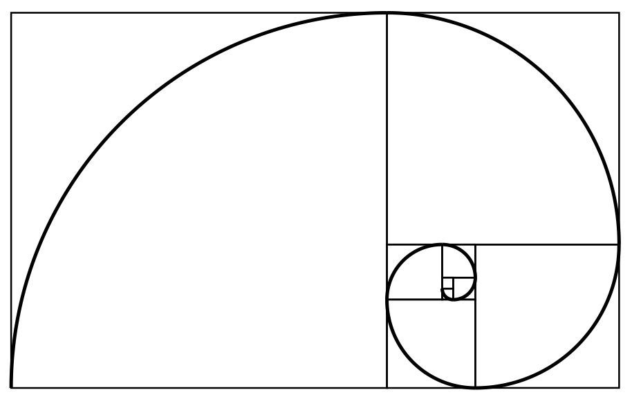
Vignelli mentioned the Golden Rectangle in his Canon. There’s something about the height/width ratio that’s naturally harmonious. So from the Wikipedia page about it, I found an image of a Fibonacci spiral for the proportions.

I felt like putting a border around the poster, so I did an image search for poster borders and found the Gwenzula Wanted Poster Supessoups Deviantart HD Wallpapers and downloaded it.

I put everything together in Photoshop. I rotated the spiral and the border 90 degrees and adjusted the pixel dimensions of both so they had the same height. I pasted the spiral on the border, and then scaled the border layer so it was the same width as the spiral. That gave me my Golden Rectangle. I changed the layer blending so you can sort of see some of the spiral. Then I put in my type. I used Garamond, a classic old style typeface known for its readability, and used the eyedropper tool to choose the type colors from the border. That gives a bit of color harmony to it.

The next trick was to get the GIF in there. I knew I wanted to paste the poster as the top layer of the GIF, but I had to get the pixel dimensions right first. I copied one of the frames from the GIF and pasted it on the poster, and it was way too small. The GIF was 640×480, so I made the width of the poster 700 pixels and pasted again, and that seemed okay. I went to the GIF and used the Image->Canvas Size function to make the size match the dimensions of the poster, then I pasted the poster as the top layer in the GIF. This covered up the GIF, so I changed the layer blending mode to Darken. Because the white of the poster background is lighter than the scene, the scene shows through. I tried to tweak it a little to bring the scene down just a little bit, but I couldn’t get that to work across all the frames of the animation, so I left it centered.

Was it worth it? I don’t know. It’s all in the game though.

Wire 106 Radio: S02E03/E04/E05 “Hot Shots,” “Hard Cases,” and “Undertow”

Image credit Nicky MemitaBelow are the discussions of the The Wire episodes we had during week 4 of ds106. They were all done on ds106radio given we were introducing audio and focusing on listening. Turns out it was also very useful for me because it forced me to get back into figuring out the intricacies of ds106radio. Pulling in folks from Google Hangouts and/or Skype, as well as playing sound clips, music. etc. is not always intuitive. I took the time during week 4 to get back up and running with the greatest course radio station ever, and Alan Levine’s post on his configuration was invaluable to the process. #Blogging4life

I also had some help from the station’s founder Grant Potter, who archived the first show of the week for us. Also, special thanks to Mikhail Gershovich for helping me test the setup out—you can hear us talking about the setup in this bit of audio Grant captured.

Below are the three radio shows in their entirety, along with links to all those who took part in the discussions. The setup worked really well in my opinion. Everyone was asked to share an audio clip from the episode they would like to discuss. And we went round robin with about 4-5 minutes on each clip—this really helped focus the discussions. What’s more, it also helped tremendously that we listened to each of these episodes the night before these discussions as a class on ds106radio.

Season 2, Episode 3 “Hot Shots” (9/17/14)
Participants: Maggie Stough, Imran Ahmed, Brittany , Stefanie Reutter, Paul Bond, and myself.
[jwplayer mediaid=”15853″]

Season 2, Episode 4 “Hard Cases” (9/18/14)
Participants: Melinda Albrycht, Allison Thoet, Syd Bauman, LaKisha Mahone, Paul Bond, and myself.
[jwplayer mediaid=”15854″]

Season 2, Episode 5 “Undertow” (9/19/14)*
Participants: Imran Ahmed, Paul Bond, and myself.
[jwplayer mediaid=”15855″]

*  Unfortunately episode 5 was cut off a bit because I didn’t start archiving until about 5-10 minutes into the conversation, mea culpa.

Nevermind the Selfies

sid_selfie
I took the opportunity of teaching ds106 again to finally take a stab at Tom Woodward‘s historical selfies assignment. If I hadn’t waited until the last minute, I would have done a string of The Wire selfies, which I still plan to do. But given I did all my visual assignments in two hours last night, I’ll think of this as a warmup for bigger things to come. Because I have to say this is a very fun assignment, a a few other ds106ers have been trying it as well to great effect.

But in the meantime, I tried to do something punk rock because if it doesn’t look that good its all right because it’s part of the ethos ;) I took the following shot from Alex Cox’s brilliant 1986 film Sid and Nancy as my image of Sid Vicious (so already a couple of mediations in given this is actually Gary Oldman).

Chloe Webb and Gary Oldman in the film Sid and Nancy

I cut Sid out of the above image and pasted him into a layer with the old school, black and white image of the Chelsea Hotel (included below) using GIMP. Once I had the selfie image, I brought it into the Photoshop template (which worked seamlessly in GIMP) that Tom Woodward shared as part of the assignment. I scaled the selfie layer to make sure it fit over the image area in the template. After that, I adjusted the likes and hashtag layers in the template to show Sid was out of favor at this point in his career (only 2 likes!), and was in NYC—if you didn’t pickup on the Chelsea Hotel bit. Also, it was worth reinforcing his relationship status with Nancy. But the hashtags were an overt, if not pedantic, foreshadowing that this may be his very last selfie.

hotel_blog

ds106 Salad Days

I’ve been admiring assignments like the Shakespearean LOLcat for a while now, and this time I decided to stop analyzing and start paralyzing with my awesome art! I knew the quote I wanted to do right away. It’s a line I’ve repeated regularly since reading Antony & Cleopatra in undergrad because I love the way it sounds—and it allows me to condescend my egregiously green judgement in the past. I’m just glad we didn’t have Facebook then, but I digress. It’s from the very end of Act 1, Scene 5 and spoken by Cleopatra when she is bemoaning her youthful fling with Ceasar:

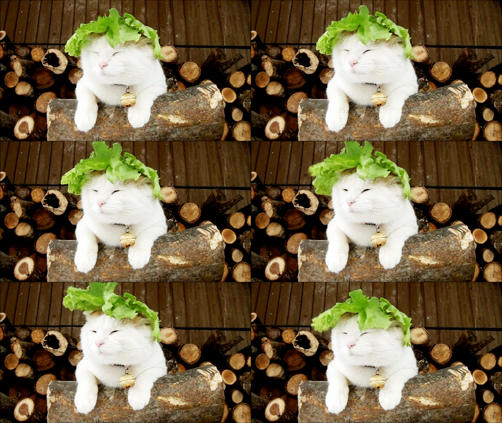
My salad days,
When I was green in judgment: cold in blood,
To say as I said then! But, come, away;
Get me ink and paper:
He shall have every day a several greeting,
Or I’ll unpeople Egypt.

Given the focus on salad days for this quote, I then searched for a LOLcat and salad on Google and found this bit of magic, in animated GIF form no less.

So, I downloaded the GIF and brought it into GIMP with the idea that I would add the quote to every layer. But it turns out this animated GIF was done as a mask (you can see how to do GIF masks in GIMP here) which means much of the background is untouched— and the GIF is smaller and cleaner.  After realizing this, I simply aligned the text on areas that do not animate, and merge them down to the background layer. This made the text appear consistently.  The only other hack around was airbrushing a black background for the second part of the quote because the green was getting lost in the log. I tried adding a drop shadow to the edges, but for some reason couldn’t do it in this GIF—anyone have any ideas why not?

Anyway, that was fun, and 2.5 stars to boot :)

Wire 106: Week 6 – The Design of Things

Wire episodes: Season 2, Episodes 9, 10, and 11.

DailyCreates: 3

Video Discussions: If the following times don;t work for you, let us know times that do for future weeks. Also, you have to be part of at least three video discussions by semester’s end.  Sign-up for this week here.

  • Episode 9: Wednesday, October 1st at 3:00 PM
  • Episode 10: Thursday, October 2nd at 5:00 PM
  • Episode 11: Friday, October 3rd at TBD

Lunch: Given my schedule, there will be no wire106 lunches this week, but check back next week.

This Week’s Design Assignments

Continue reading →

The Vignelli Canon

canon-1Another design resource that’s worth looking at is The Vignelli Canon. It’s a short booklet by Massimo Vignelli, who was a superstar in the world of graphic design. The booklet is light on text and heavy on space and imagery, so it’s a quick read. His purpose in writing it was to share his knowledge for the benefit of other designers. As he says, “Creativity needs the support of knowledge to be able to perform at its best.”

Vignelli did most of his work in the pre-Internet era, when graphic design meant ink on paper, so some of the information is not so relevant to our online environment, but the principles still stand. So take a look at it, and let us know what you think.

Red Moon

I went through the assignment bank to see what hadn’t been done yet, and I was surprised to see the “Image Manipulation and Historical Narrative” hadn’t been done, so I decided to fix that. I figured I would take one of the more iconic images from the space landing and photoshop it—again :)

appollo11

What if it wasn’t us? So uch of the investment in science, research and technology was spurred on by the Cold War, in particular Sputnik. In Where the Wizards Stay Up Late, Katie Hafner links Sputnik to the funding of ARPA which effectively gave us the internet. The same year we got a man on the moon, although the latter is controversial :) So, what if the commies got there first?

appollo11_goes_red

This was a fun assignment because it forced me to play with the perspective tool in Gimp, which was pretty simple and slick. I grabbed an image of the sickle and hammer in Google images that was wind blown, and added it to the Apollo 11 image as a layer and changed the perspective and blurred the edges. It’s not perfect, but enough for the illusion, and it’s good practice for design week!

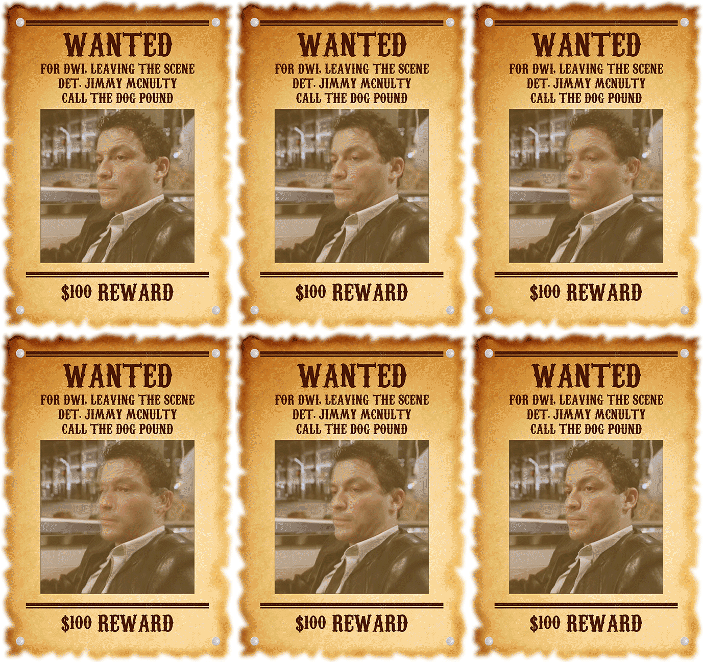
Wanted: for DWI


mcnulty

I thought the idea of a Wanted Poster assignment was perfect for wire106. Hats off to Kris for making it. McNulty ought be get hauled in for his escapades in the last episode, so I thought he’d make a good subject. But I’m all about the animated GIFs, so I took it down that route. I used the same poster generator as Kris because I’m lazy, but it stopped my GIF from animating. So I made a new layer on top of my GIF and changed the Image Size to match the poster that the site made. I copied the poster, minus the part with the picture, and pasted it on the top layer of my GIF. I had to resize the poster layer a lot until it lined up right. Then I decided I didn’t like the color image on the sepia toned poster. I looked for an easy filter in Photoshop but didn’t see anything I liked. So I repasted the poster, this time without leaving out the image. Then I changed the layer blending mode to Screen, which sort of washed out the color of the GIF. Since the image is on the poster layer as a constant, it gives a double-vision effect during the animation, which suits his intoxicated look.