
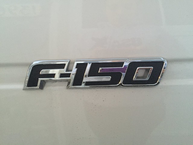
Typography is the “visual component of the written word.” Signs, logos, it’s all topography. I chose to show this element of design with the F-150 logo of my dad’s truck. I believe this represents the car brand because it uses a bold font with a heavy weight. You wouldn’t want to use this for a tiny sports car. It is definitely a good use of typography to have for a big truck.
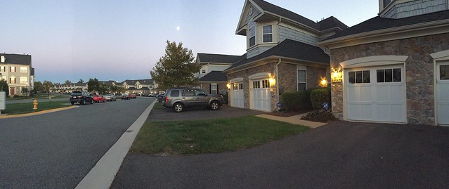
The condos in this neighborhood I thought was a good representation of rhythm. They’re all identical with the brick garages and paneled upper level. I think the repetition is a very nice design for this neighborhood.
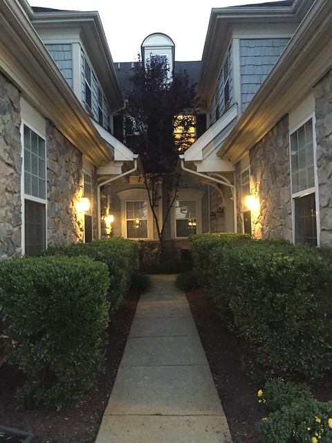
I believe this alleyway between two condos is a good representation of symmetrical balance. The bushes, windows and lights (one is actually out on the right) are all almost identical to each other.It almost looks like each side is a mirror of the other. Everything is doubled except for the single tree in the middle which brings everything together.
https://www.flickr.com/photos/126467562@N03/15199079937/
I like the use of proportion of the rocks in this picture. They are all different shapes and sizes, but together they all kind of fill in one another to create this balance as a whole wall.