
In my designblitz, I hope to use images to explain my interpretation of design terms. There are several terms that we were given to research and try to catch images of at least five of them. The terms are color, typography, metaphors/symbols, minimalism/use of space, form/function/message, balance, rhythm, proportion, dominance, and unity. I hope that my images will give examples of some of the terms.
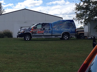
The first image will be of the use of color. The image is of a truck that is being used for advertisement for AMS oil that is used for RC airplanes, RC trucks, and motorcycles. The front of the truck uses images similar to an American flag and the back of the truck shows clouds. The clouds definitely creates a positive image for pilots to view big fluffy clouds in a blue sky. Just by using colors, this advertisement creates a positive feel for it’s product.
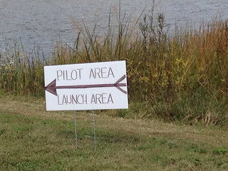
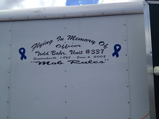
The next image that I will show is to show an example of the term typography. I have two examples actually. One is a hand made sign that is simple and to the point. It portrays important information to the intended audience with just a few words. The print is big, easy to read, and simple. There was no confusion on what message the sign was trying to pass on to the reader. The other example is a memorial message that my husband has on the side of his airplane trailer. The font and message is intended to show the brotherly love that he has for his best friend that died in the line of service in 2008.
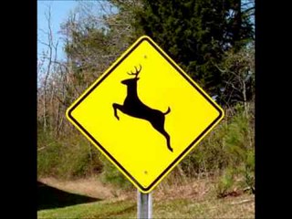
The next example that I have an image for is the use of symbols or metaphors to represent an idea or object. This image is a simple sign that tells so much without the use of any words at all. The image is of a sign of a jumping deer on the side of rt 522. The color of the sign is yellow which portrays caution and the deer jumping tells the driver that deer frequently jump out into the road in this area. This gives so much information to a driver in just a few seconds while passing the sign.
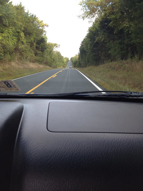
The next example that I have an image for is the term balance. In my Art class, we have discussed many times the importance of having balance in your work. This allows the viewer to enjoy the image without being left subconsciously the feeling that something is missing. The concept is very similar to never ending a song in a minor chord. The audience is driven to “fix” the sound since the major chords are much easier to the ear than the minor chords. Same concept with having a balanced image. There is harmony when the left and right sides match. This image is a view on rt. 522. The highway just goes on and on looking just like this view.
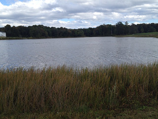
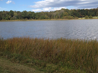
The last example that i am going to portray is rhythm. Rhythm is the repetition of elements. To explain this by an image, I found that the rhythm of the water portrayed a rhythm for the eye. The water of Lake Ritchie was very choppy and had a steady rhythm. I hope the two attached images will show the rhythm that I saw.
I hope you can see the terms that I am trying to portray in my images. I also hope that by viewing my images, it will help explain each of the terms.