Kidding. Design Week didn’t ruin my life. But i grabbed your attention, right? Yeah, i did. Believe it or not, Design Week was fun. I messed around with different tools and effects and overall enhanced my awesome skills. If it were up to me, i would wish that design week was maybe a week earlier. Life wanted to dump on me and planned two tests and a ton of reading for my other classes. Unlike my other classes, Ds106 is something i look forward to. It’s never dull or tiring. Well, it can be tiring, but in a good way. Now, this post isn’t to sell ds106 to you, but explain how i felt this week. So, let’s get to it!
Daily Creates (3):
Wednesday
Fun, fun, fun. Daily Creates are always the best because they’re simple, quick, and fun. My first daily create was started on Wednesday with “Water and Glass.” Not too bad, just put water in a glass and create some movement. So i borrowed my suit mate’s glass and used my own water! Sorry for the vertical recording, i’m sad and only have an iphone for recording. My post is here and below is the actual video!
Thursday
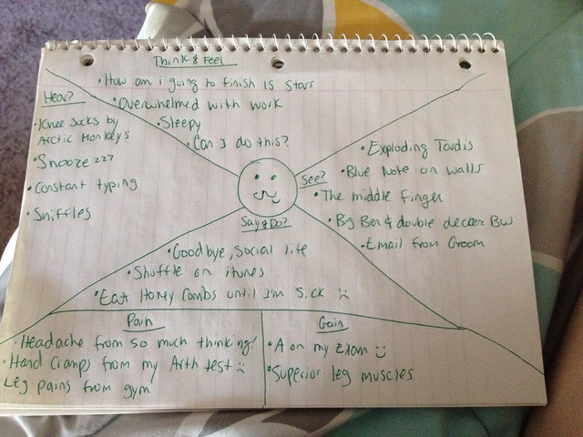
Empathy, yes, my favorite thing. Since this week has been pretty stressful, this was a great way to get it out. The “Empathy Map” daily create i used the template that was available and entered in alllllll my feelings and actions. Getting to write down my problems and post about it here is a way i can force you to listen ![]() Now here’s the map.
Now here’s the map.
Saturday
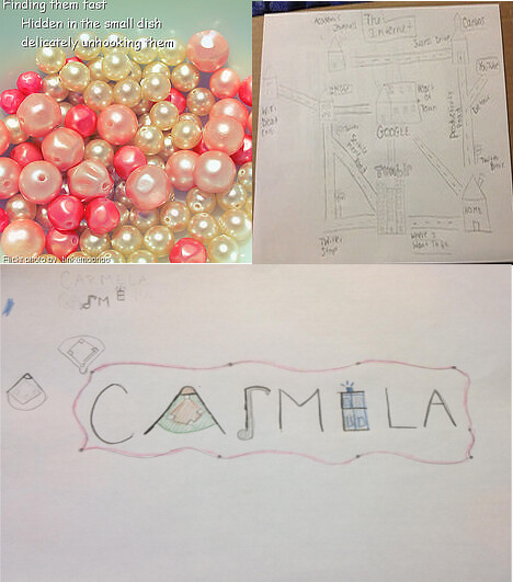
The last daily create of the week! Coincidently, this was also the 1000th daily create. If that doesn’t excite you then i don’t know what will! All we had to do was combine three of our daily creates and blog it here. I enjoyed the concept of “power of 3.” I’m not a math person but i understand the concept. I also realized that i was suppose to do the 1st,10th, and 100th tdc. At least, i think so? I’m still a little confused about that so hopefully i did it right! But here it is!
Design Assignments
15 stars was this weeks goal and i think i went over that. At least, i hope so! Let me show you all my assignments now ![]()
Create Your Favorite Book Cover: 3 stars
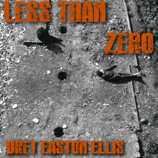
This assignment was fun. It wasn’t as difficult as i would think it would be but nonetheless, it was fun. I chose one of my favorite books titled Less Than Zero by Bret Easton Ellis. My blog post went into a ton more detail than i will here but i’ll show you my final product!
Create a READ Poster: 3.5 stars
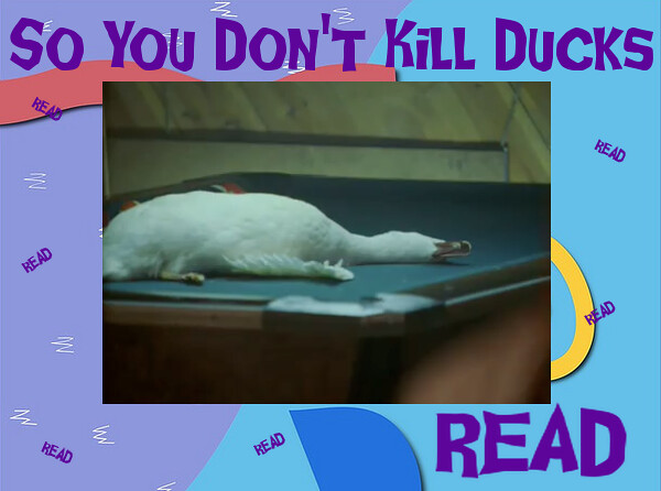
READ. That’s what we should all do, right? This assignment may be my favorite this week. If you’ve ever been to the library, you’ve seen one of these posters. Since i needed to incorporate The Wire into this week, i chose Ziggy killing his duck. The story in my post is pretty funny and the process is included. Now everyone, let’s READ!
Bumper Sticker: 3.5 stars
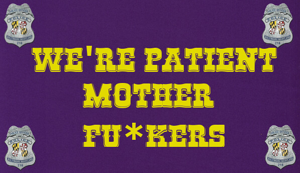
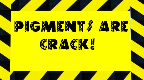
This assignment seemed very simple to me, which is why i took a different route to it. I made everything but cropping/inserting/typing in everything except for the background color. It actually took longer than you would think. So, please, read my separate post about it so i feel accomplished. You can also cheat and just look at the bumper stickers below!
On The Cover Of A Teen Mag: 3.5 stars
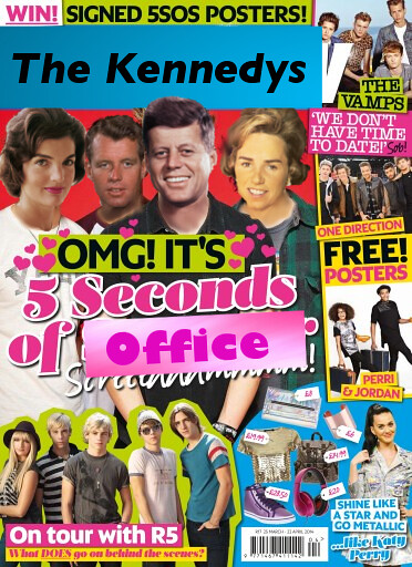
Magazines. We all read them whether we like to admit it or not. When i saw this assignment, i was compelled to do for many reasons. The most important one being this looked like fun. Yes, actually FUN! When i blogged this assignment, it took a long time so you have to read it, obviously. You can also find the original magazine cover there. I’m like a Reading Rainbow episode. I’ll give you a little bit but you’ll have to earn or read the rest ![]() Also, if you like The Kennedy’s, why not?
Also, if you like The Kennedy’s, why not?
Guess The Song: 3 stars
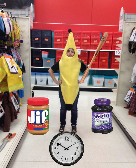
Guessing a song has always been my favorite thing to do. Maybe because i watched an excessive amount of MTV as a kid. Before it turned into a Teen Mom network. Since i had a picture of myself in a banana suit, this assignment was an obvious choice. So you get more clues, look at my post about it here and have a go!
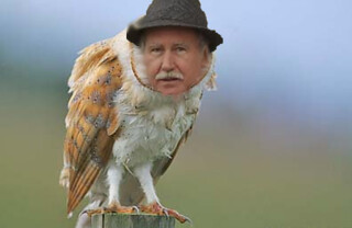
Paste Someone’s Head On an Animal: 3.5 stars
Like the title of my blog post says, “Finally, 8 Stars.” I did this assignment pretty quick, as you can see, because i didn’t have 8 stars worth of design assignments pertaining to The Wire. This assignment was a nice way to complete those stars. This doesn’t mean i didn’t put any effort in it, because i tried! I really did. Hopefully you get a laugh at the new and improved The Greek.
The Wire
Yay! being assigned to watch a TV show is awesome. I enjoy blogging about my reactions to each episode but this week i’m reigning in my feelings. I’ve been trying to use the new design vocab and identify them in the episodes. It’s a lot harder than you think. I’ve noticed the easy colors and metaphors but the rest is hard! Lauren did a great job in finding the “use of space” in one of the episodes. Sadly, my skills haven’t developed that far yet. Give me a week and i’m pretty sure i’ll rock these elements.
DesignBlitz
Yes, now this is a good assignment. I really enjoyed doing the Photoblitz last week and now we get use our new design skills. I chose the 4 elements: Color, Typography, Symbols/Metaphors, and Balance. The hardest part of this assignment was finding the best example for those elements. I tried to stretch my mind a little with this, so hopefully you notice! I took advantage of being home and found what i deem worth of great examples. For better detail, obviously click on my post here about all my examples.
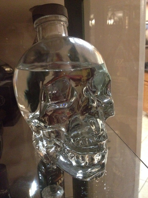
Symbols/Metaphors:
This was a good example. Alcohol in a skull shaped bottle. Is this killer, or what? Yeah, that pun was intended. Deal with it.
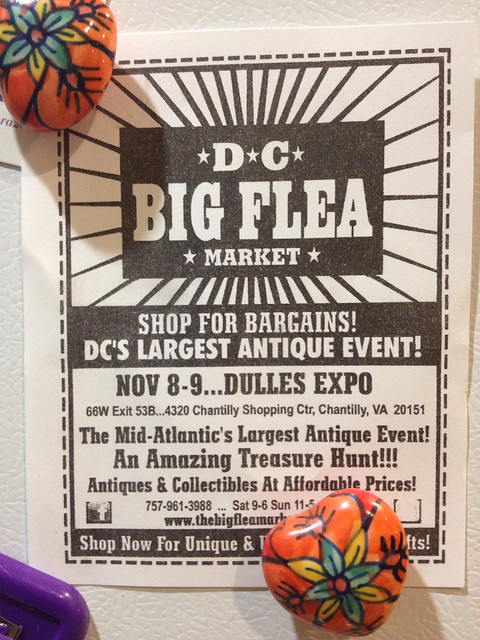
Typography
I was looking for a big change in font to show how important typography is. Your professors always notice whether you use Times Roman or Comic Sans, so it is important. This Flea Market used the common Circus type font so that’s how it grabbed my attention.
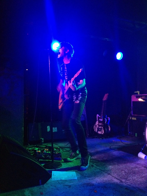
Color
Color sets the mood for anything. When i saw We Are Scientists in DC this past Friday, i thought of this element of design almost immediately. That just shows how much i love ds106, right? Yeah, it does. The color was more obvious for the slower, more sad songs of the set list.
Balance
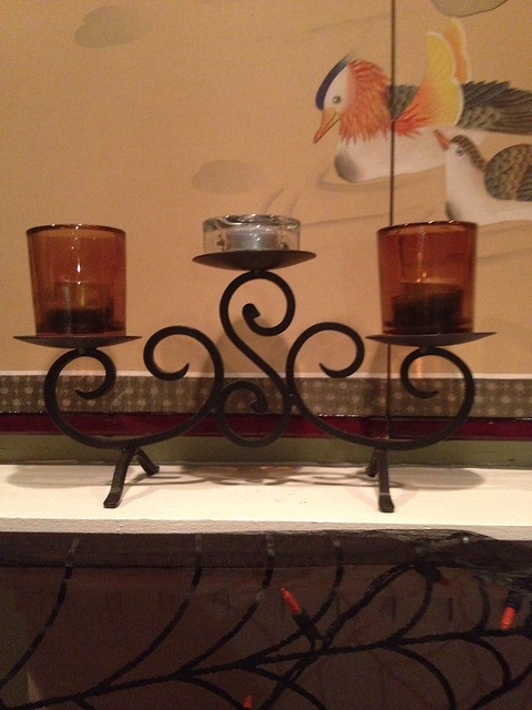
Lastly, balance. This element was a lot harder to find than i thought. Like i mention in my post for designblitz , i believe this all depends on the viewer. Some people find more things balances than another. Since i’m the one doing this assignment, i stuck with the candle holder on my parent’s mantel. I based it off whether or not if i cut the photo in half, would it be symmetrical. As you can tell, it was. Now you tell me if you buy it!
Video Discussions
Boo, i wasn’t involved with any. I will be doing this next week, i hope. It just seems like every week i don’t have time. Don’t worry ds106, i will make time!
Comments
Last week, Groom mentioned that i should comment more. This week, i tried more than the previous weeks with commenting. I was really successful in the beginning but then i drifted. That’s still improvement though, yeah? Well, here are my comments!
-I enjoyed John’s simple task of the water and glass daily create.
-Another simple assignment i enjoyed was Jessica’s “ICON” assignment. I knew exactly which icons referred to parts of The Wire
-Lauren’s example of the design element “use of space” was spot on. After i watched that episode, i went back to those specific scenes to catch this element.
-Stefanie’s “Swap heads” picture was hilarious. McNulty IS a dog in the show, so this was perfect.
-The layout of Meredith’s assignment was well done. I could tell she spent a lot of time on it.

