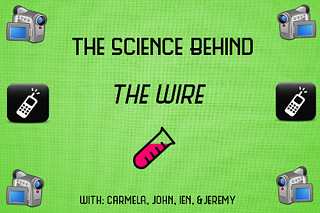
As you all know, we are required to create a promotion of some sort for our radio show. My GIMP skills are grown tremendously over the weeks and this totally proves it. The main focus of our radio show will be about the science behind The Wire, as you can tell with my little poster below. What we want to focus on with science are the wire taps and surveillance. This explains why there are phone and hand recorder cartoons. This is a huge part of the show and we think it’s worth talking 30 minutes about. Let me talk about how i created this beautiful piece of work!
The Process:
Last week during design week, there was an assignment i picked called Bumper Sticker. What i did here was basically the same exact thing except instead of focusing on an episode of The Wire, i focused this on our radio show. I decided that since this is the science about the show, i chose green. I mean, green is the color of science, right? So that’s how i started this whole thing off. A nice light green background. Then came the cool little icons!
Icons
Since we’re mostly going to discuss surveillance and taps, which is huge in the show, i googled little cartoon versions of a camera and phone. These were perfect to use as a border and to grab attention.I decided that since the word “science” was on my poster, i should also include something scientific. What’s more scientific than a test tube? That’s basically what science is, duh. After i collected all the icons the next part was cutting them out. I opened each icon on a separate page and cut them out. Once i had them all cut, i opened them as layers on top of the green background and placed them appropriately. How awesome. Now i just needed to add the text!
Text
I couldn’t just use Times Roman for this. If i’m going to stay strong to this science theme, i went on dafont.com and literally typed in science. This cool, retro font called “science fair” popped up. Boom! There was no doubt that i wouldn’t use this. My only struggle with this step was having to adjust the font size. Overall, it was fine. The title looked fantastic. I had some space left over so i decided to add our names at the bottom, i mean, that’s important too! I think this is really cute little promo for our show. Hopefully it attracts everyone to tune in!