For my second Visual Assignment this week, I did “What a Crappy Font Will Do.” I decided to go with Google because their font is so well-known. I wanted to change it to Courier New because everyone always makes fun of how ugly it is.
How I did it:
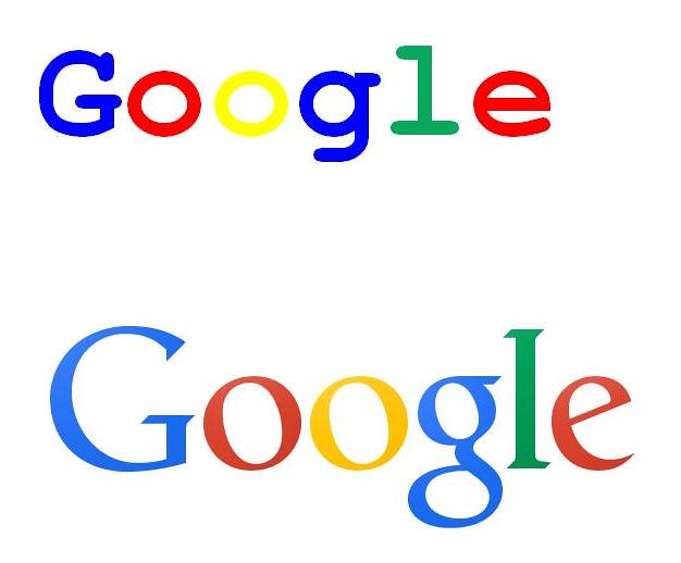
I saved a picture of the Google logo from here. I copied and pasted it into Microsoft Word so I could look at it while I made the new logo. Then I selected Courier New, made it bold and typed Google. I then changed the colors so that they matched the actual logo. I then screen shotted it and pasted it into word so I could save it as a picture. When I saved it as a picture I opened it with Microsoft Photo Editor and cropped it so it was just the two logos. Then I posted it to Known.
Here is my creation. I think it is uglier in Courier New but I expected it to look significantly worse than it does. It actually doesn’t look terrible but definitely not as good as the actual Google logo.