
I decided to do the designblitz in my living room, mainly because I didn’t feel like leaving my apartment, but also because I thought it would make for a more interesting challenge, which it did because all we have in our apartment is Harry Potter posters and books.
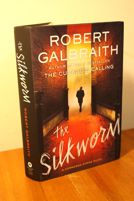
This is the first photo that I took for the designblitz, which was meant to portray typography.
I used this book cover because the typography was so interesting. The title of the book is written in a script font, which is very dramatic in a large font. Comparatively to the very serious font used for the author, it is not fun, but seems more natural. I think this is effective typography because the contrast between the two fonts is very eye catching, especially on the spine of the book (which is what you would first see of it at the book store).
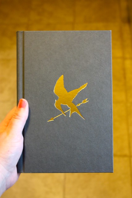
This is the second example I found for the designblitz assignment.
This is the very minimalist cover of The Hunger Games. Granted my copy is missing the dust cover (but a lot of people loose those anyways), but the book itself only has the one symbol on the front. It doesn’t even have the title of the book on the cover, only on the spine. I thought this was a great example of minimalism because this is about as minimalist as they could have gotten without just having a blank cover.
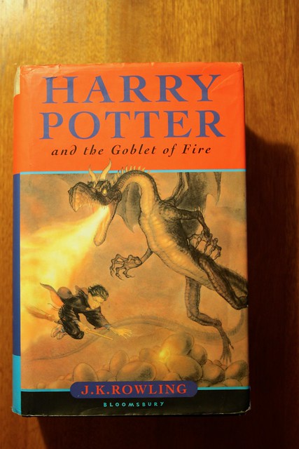
This is the third photo I took for the designblitz. This photo is meant to convey proportion in design.
I decided to use this book because I think it is a very powerful image on the cover, which manages to portray the intensity of the book. Whereas the other Harry Potter books that came out before this took the whole book to lead up to one big adventure, this book was a series of very intense adventures, one after the other as Harry is in a competition for his life. The proportions on the cover of the dragon vs Harry really shows how much danger he is in. He was the smallest contestant and got the scariest dragon, and the fear associated with taking on a dragon comes across well in this cover, as Harry is being towered over by a fire breathing dragon.
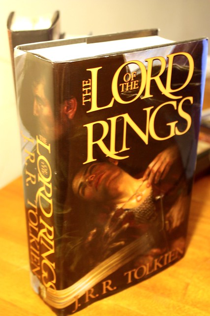
This is my fourth and last example for the designblitz assignment, meant to portray the use of color.
This weird cover of The Lord of the Rings trilogy mainly uses dark colors, mostly grays and blacks, and gold (because that’s the color of the ring). While the text is gold (it looks yellow in my bad picture, but it is really gold, I promise) the rest of the cover is colored in very darkly, and as a result has a very dark, ominous, and dangerous feeling to it. Black is associated with evil, power, death misery, etc. while gray is associated with sorrow, detachment, and isolation. These are all themes that are very present in the story of Lord of the Rings. The one ring is a “gift” from a very evil force that is looking for power and kills a lot of people on his way to get it. Frodo, as he carries the ring, has to deal with many feelings of isolation and detachment as the ring takes its toll. Although the book isn’t all depressing and scary (it’s really not everyone should read it), it is a dark book because it deals with such evil forces. I think this cover, while the picture itself is awkward, did a really good job using colors to portray the emotions of the book.